The brand concept.
A craft mead brand that takes after the story of the epic poem Beowulf, done in the graphic style of 1970/80’s sword and sorcery comic books to produce a brand that embodies action and adventure.
Mood Boards
These are collections of images on subjects and themes centred around the brand idea. This practice is a part of the visual research process that helps establish a proven visual language for the brand's messaging.
Epic Punchy Medieval Adventure.
This mood board explores themes of medieval fantasy and heroic representation in media as inspiration for the visual language of the product's branding.
Beards Beards Beards
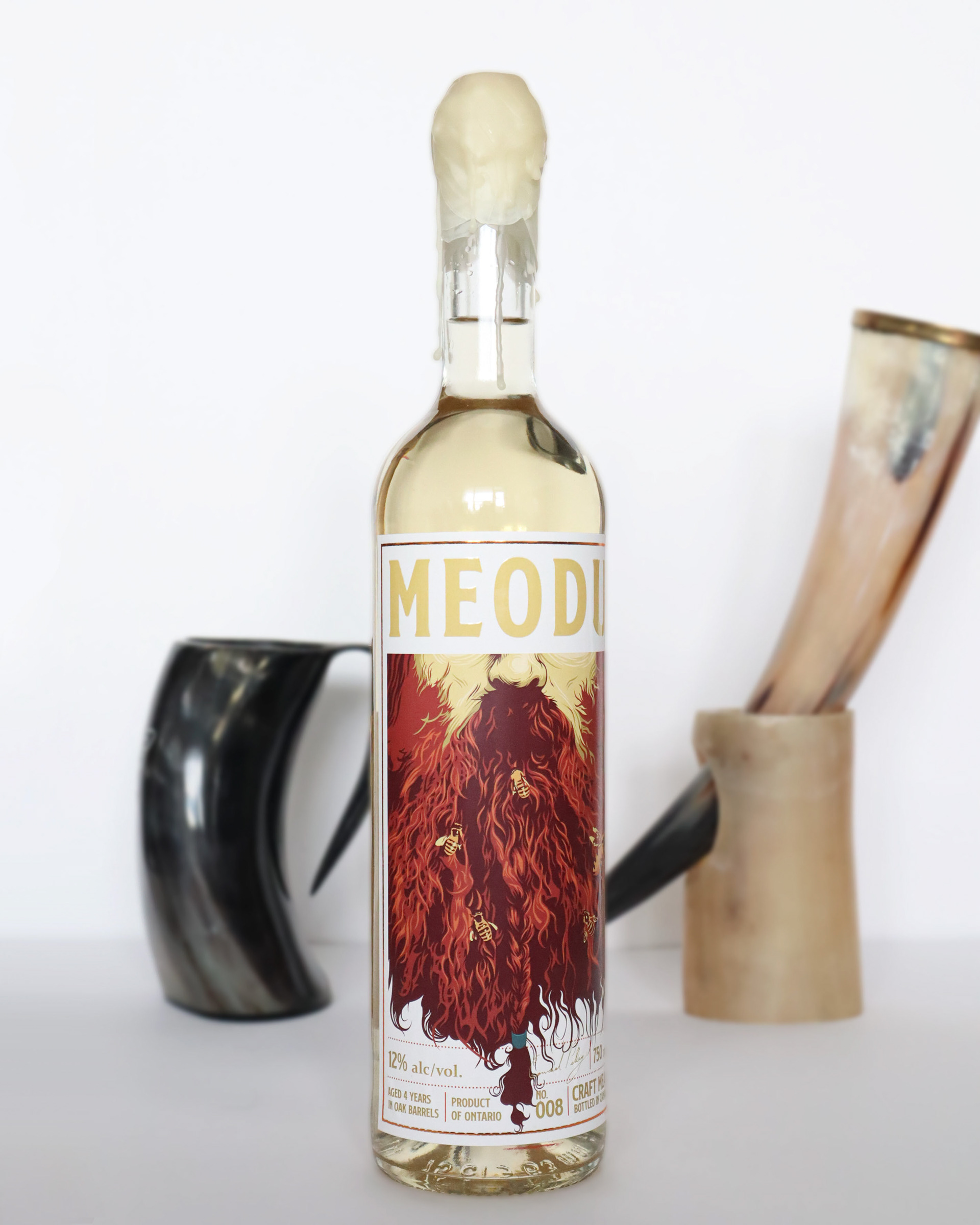
I wanted the branding to allude to the literal character the concept is based on, so I figured the best way to do this without designing Beowulf from scratch, was to illustrate the gnarly barbarian beard of our dragon-slaying hero.
Wispy Mixy Wordy Whiskey
Brewed, bottled, and branded for cultured fellas, this drink has to hold its own. The solid foundation of fat typefaces found gridlocked across whiskeys, scotches, and ryes inspired the firm foundation for Meodu's typographic treatment.
Creative Craft Brews
Like many craft beers and ciders, I wanted to give my ale an edgy-cool angle by adding a bright, funky, high-contrast vector illustration to the front label. This approach works well with some of the swords and sorcery-style medieval fantasy comic book inspiration used for the foundation of the brand's visual language.
Colour palette
The colour palette for Meodu is based roughly on the hues of yellow and amber seen in different kinds of honey. Plus, a little bit of blue for contrast.
Fonts:
Logo font:
SS Nickson One
Body Copy:
Constantia
Constantia
Logo treatment
The Meodu Logo as it appears in black, white, and treated for print on the bottle label. In a honey-yellow taken from the brand colours, with the tracking for the bottle design.
Bottle ideation
One tastes with their eyes before anything else, and so it was important during the design process that I paid particular attention to the bottle type. Throughout a series of sketches, I experimented with different bottle types, label shapes, quark types, and flourishes to conjure a visual presence that was consistent with the brand concept.
The prototype
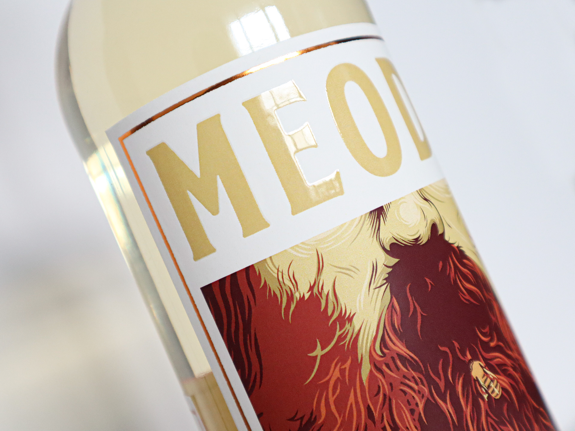
Printed as proof at last. After talking with the print company about my ideas for the production, Meodu's label ended up with a gloss finish on the logo and a metallic ink border. I also sealed the quark with real beeswax which I thought complimented the colour of the label and beverage quite nicely.
