The brand concept.
The concept for my branding as a graphic designer is based on elements of my personality translated into the field of graphic design as it appears today.
As a person, I tend to dive deep into subjects that interest me. As a designer, I use that habit to understand better my clients and what they need. I also got into the industry because I have been an amateur traditional artist for as long as I can remember. Because of my origins as a traditional artist and my passion for inquiry, I often think of my professional self as a bit of an artisan, and as such, my brand concept's visual language is inspired by the detail of preindustrial artisan craft but minimized for the platform of the digital age.


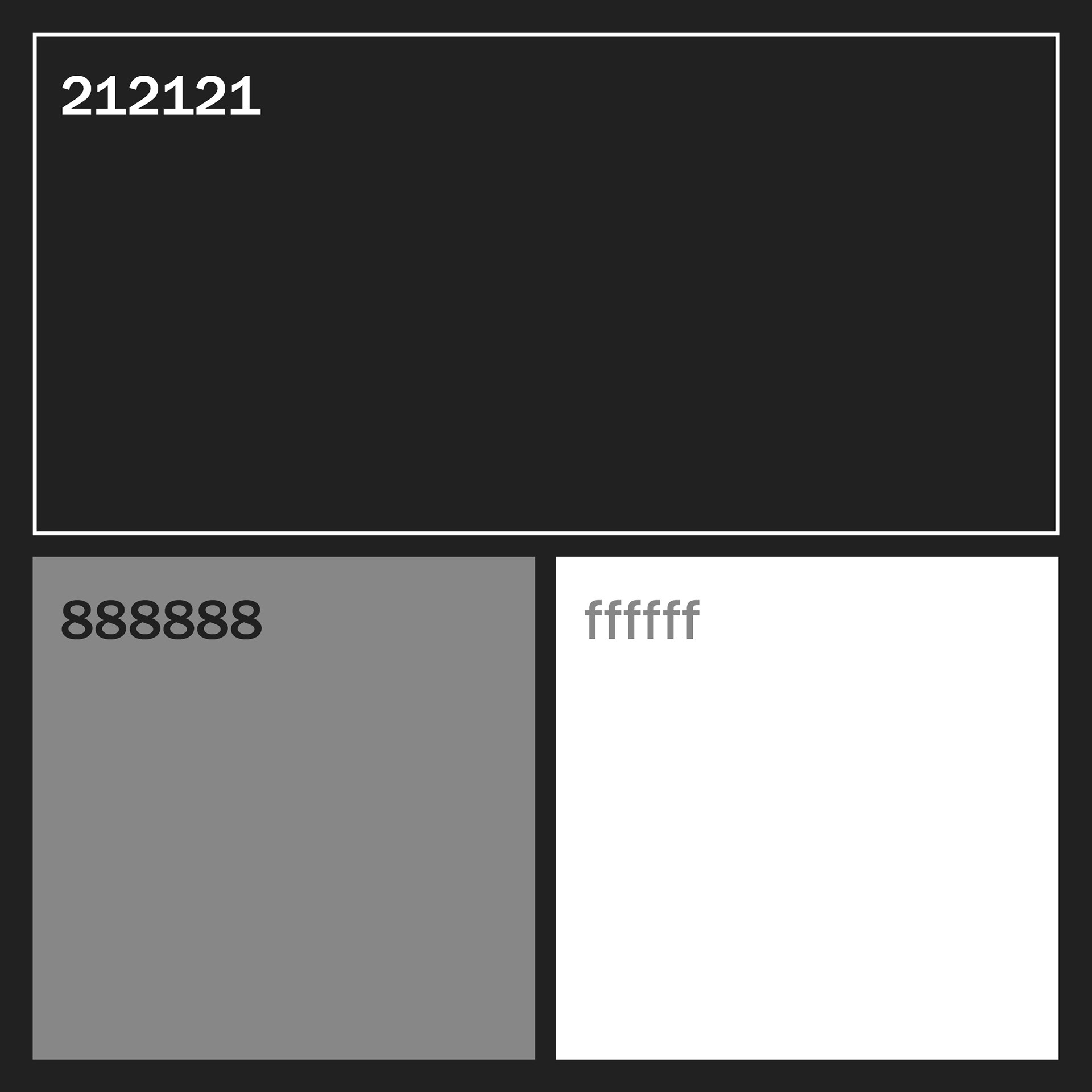
Colour palette
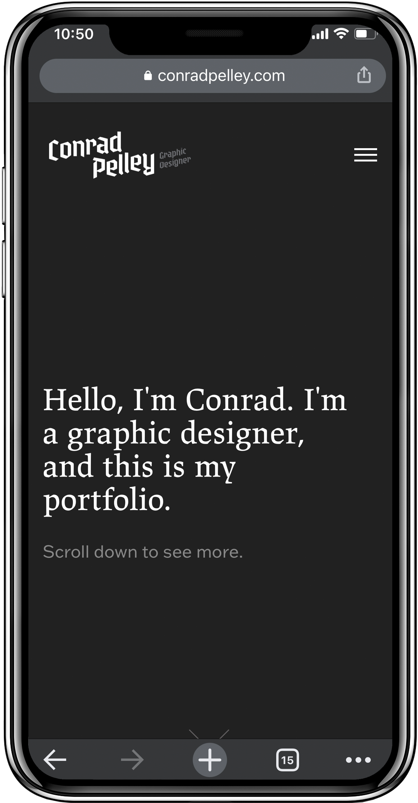
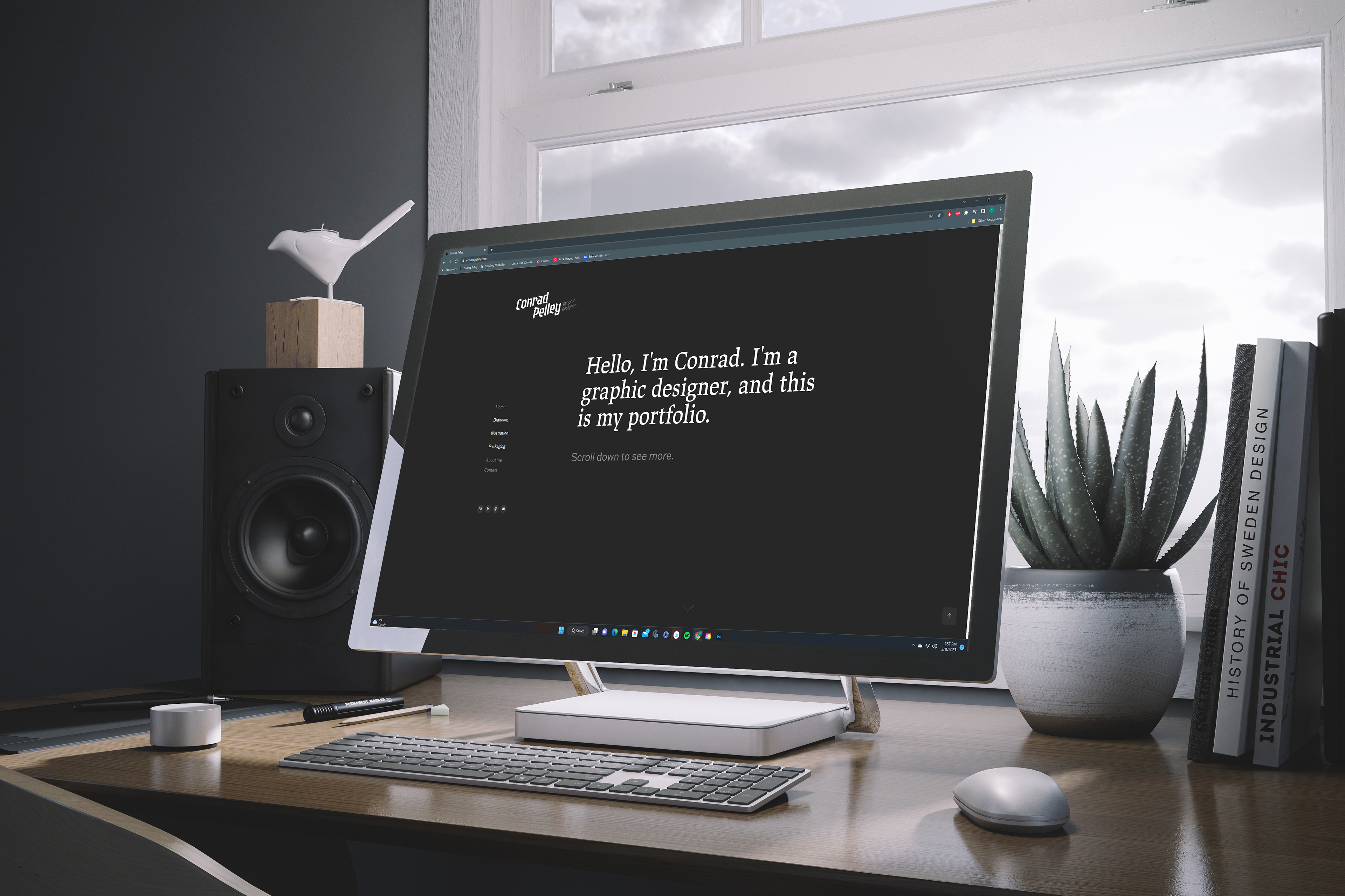
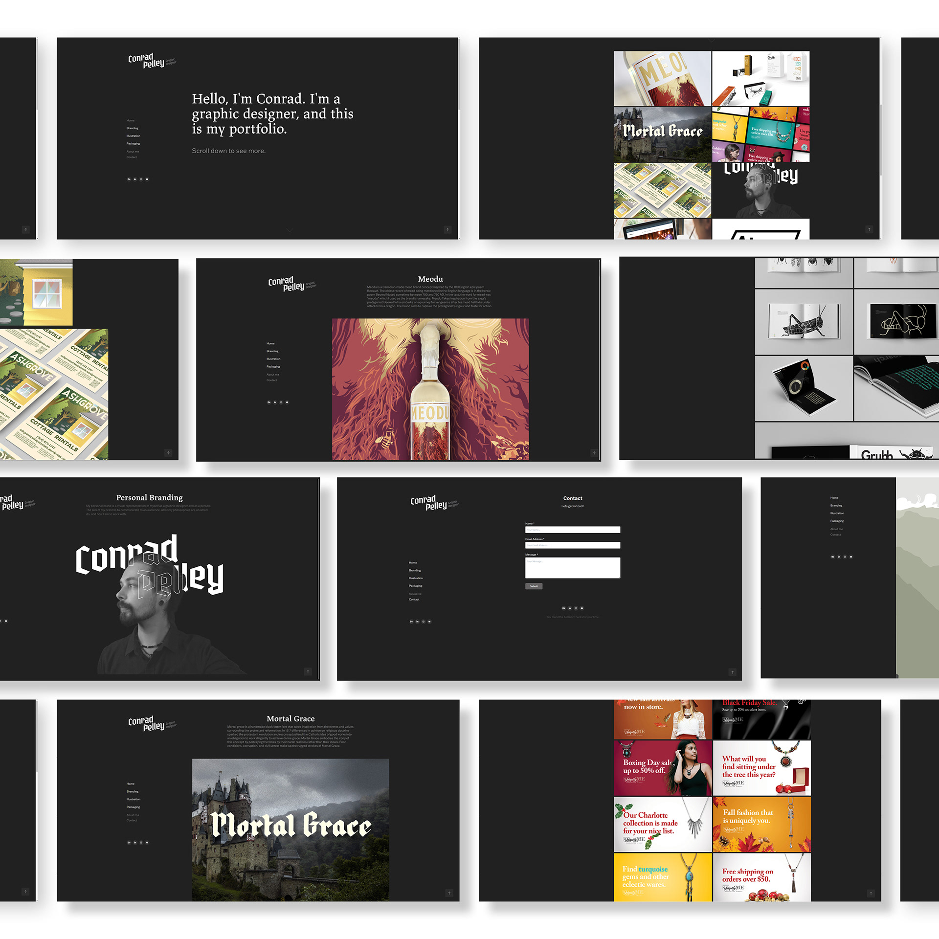
In any portfolio, the surrounding environment's colours will affect how a piece is perceived, both in tone and literally, as the human eye extracts information based on contrasts before interpreting their meaning. Because of this, most portfolios are coloured in neutral tones like black, white, or grey to avoid their work being contrasted against a colour hue. In a modern world that increasingly relies on digital technology, screen time becomes an unavoidable part of one's daily routine. "Dark Mode" originally started as an extension or option for browsers and software to make a user interface easier on the eyes at night. However, dark modes have become increasingly popular for general use during the day, as users find it less strenuous on the eyes regardless of the time of day. What might have initially seemed like an unpopular decision to cote a digital space in oppressive, forboding darkness has now become a source of comfort for those who occupy a predominantly digital world. This concept was the inspiration for my brand colours.
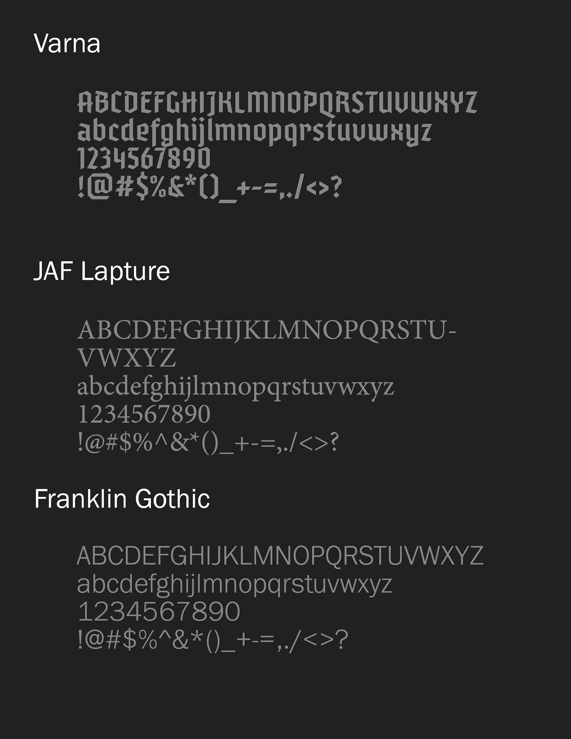
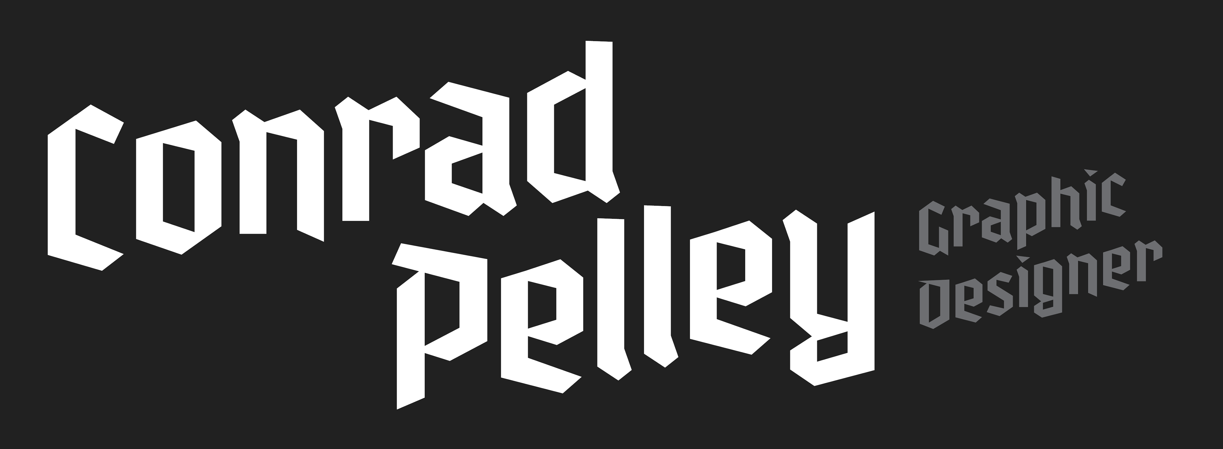
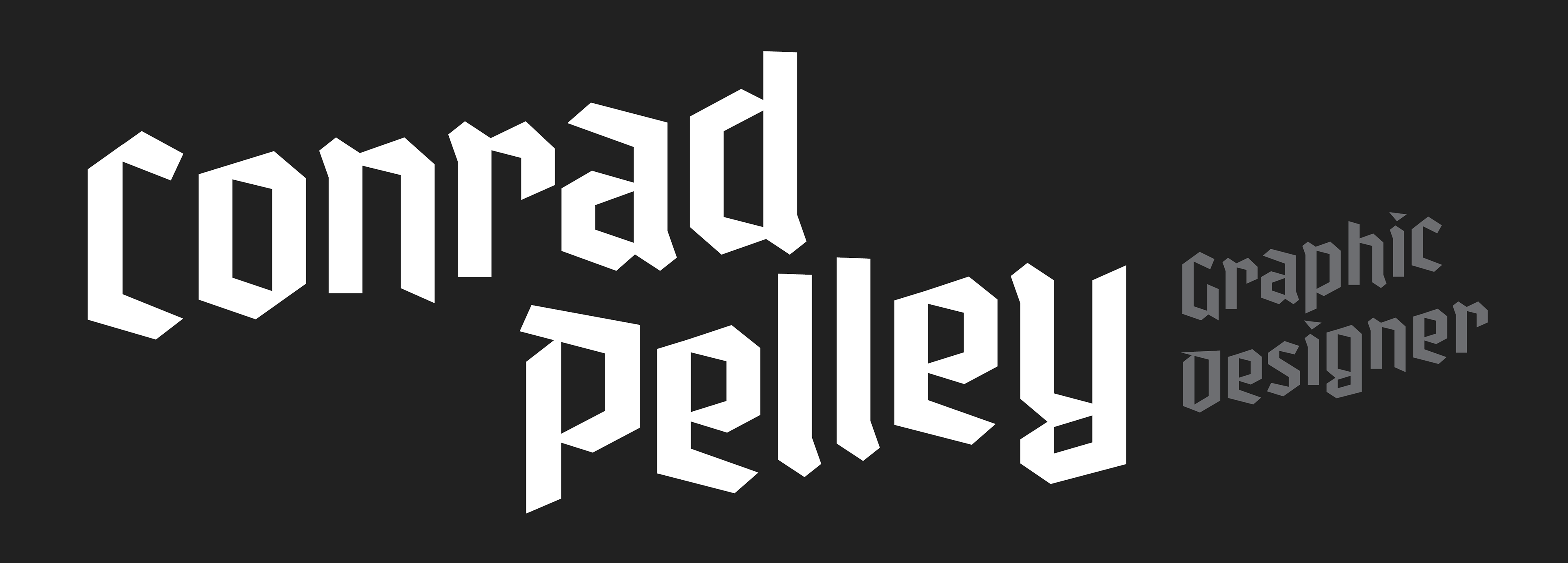
Fonts
I chose the fonts for my personal branding based on the concept of the modern artisan.